Hurry! Only 3 Slots left for this month. Get in touch Today

Reliability-driven construction materials

Jointseal is a trusted name in the construction materials industry, offering a range of high-performance tile adhesives, floor solutions, and joint fillers. With a focus on durability, precision, and ease of use, Jointseal caters to both large-scale industrial projects and modern residential developments.

Their products are engineered for reliability and consistency, helping builders and contractors achieve flawless finishes with confidence. By combining technical excellence with a customer-first approach, Jointseal continues to set new standards for quality and innovation in surface bonding solutions.

+70%
Boost in retail shelf visibility and recognition post-packaging redesign.
+40%
Increase in distributor orders within three months of the rebrand.
3×
Improvement in brand recall from marketing campaigns and collateral.

What We Did

Branding Packaging Marketing

Industry

Construction & Manufacturing

Challenge

To transform Jointseal from just another functional player in a highly saturated, price-driven construction materials market into a brand that commands trust, recall, and preference at first glance. The brand needed a cohesive identity system that could clearly communicate durability, precision, and reliability to diverse stakeholders—contractors, builders, and modern homeowners.

Approach

We took a strategy-first approach by repositioning Jointseal as a reliability-driven brand rather than just a product-led one, translating its strengths—durability, precision, and consistency—into a clear and cohesive brand narrative brought to life through a distinct visual identity and packaging system.

Bold identity for a crowded market

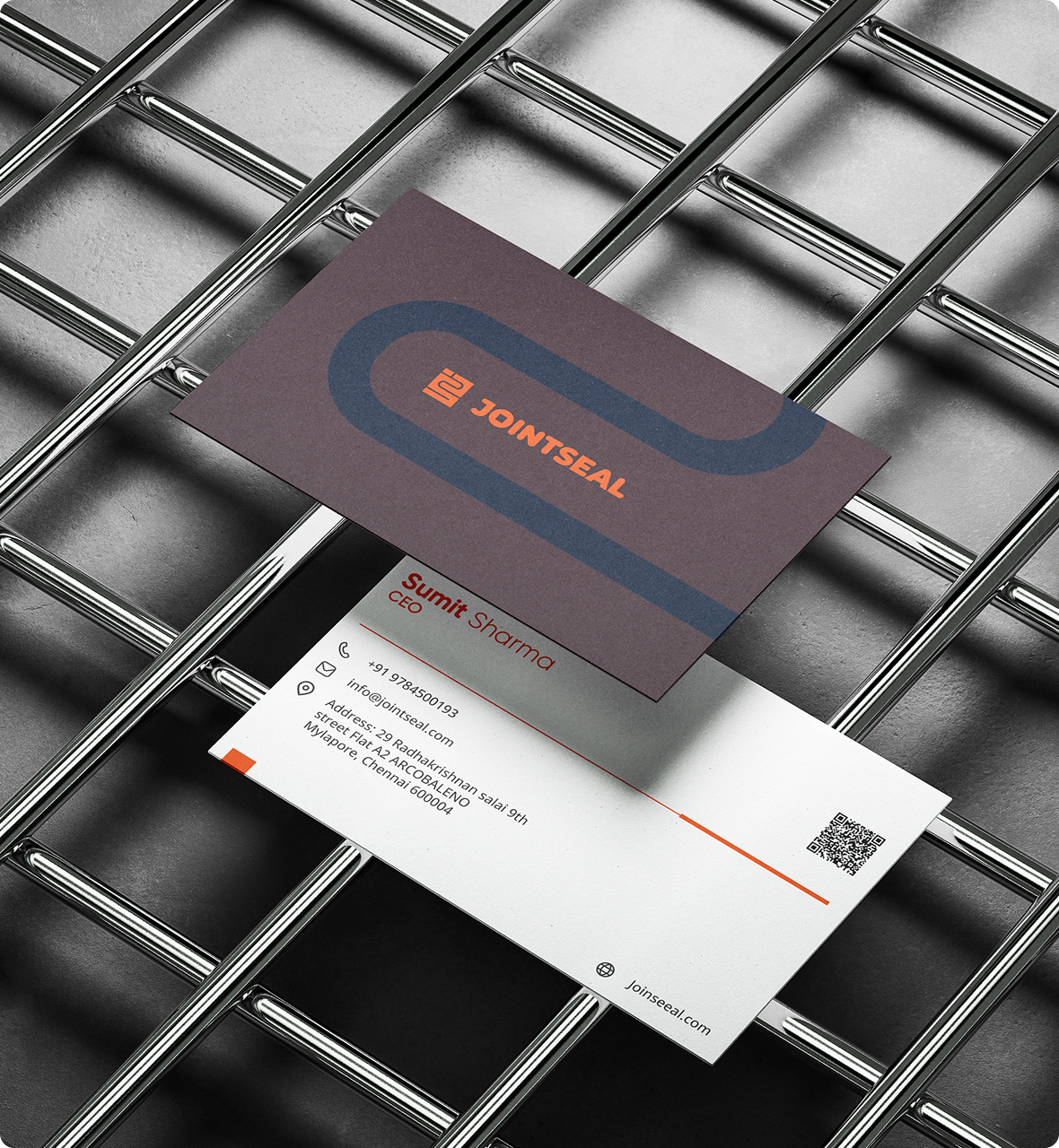
We crafted a bold and distinctive brand identity for Jointseal, centered around a strong, impactful logo that establishes instant recognition and authority in a crowded market. The color palette combines neutral tones with a striking orange accent to drive differentiation and inject energy into the brand, while navy blue reinforces trust and reliability.

Jointseal brand identity

Clean, structured, and bold typography aligns with the overall narrative of precision, strength, and clarity—creating a cohesive identity system that is both functional and visually commanding.

Jointseal logo system

Standing out on the shelf

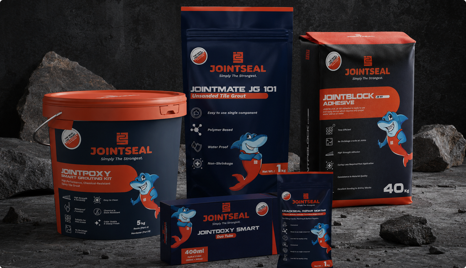
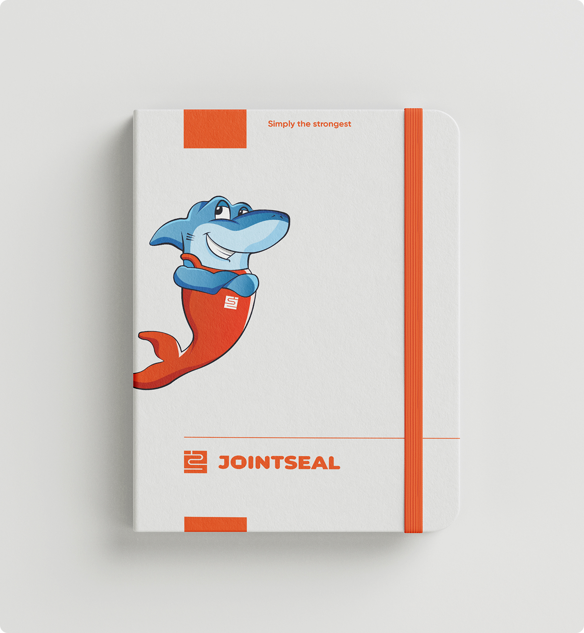
We developed a cohesive packaging system that unifies the entire product range while modernizing its visual appeal to stand out in a traditionally cluttered category. A key move was introducing a distinctive mascot, giving Jointseal a recognizable face that adds personality, improves recall, and creates a stronger on-shelf presence.

Jointseal packaging design

We designed a clear and structured information hierarchy—prioritizing product type, key benefits, and usage cues—so contractors and buyers can quickly identify the right product without confusion.

Jointseal product packaging range

Trust meets visibility

We positioned Jointseal as a dependable, high-performance partner rather than just another adhesive brand, building a strategy that blends trust with visibility. From on-ground retail presence to digital platforms, the strategy emphasized product clarity, application-based content, and brand recall.

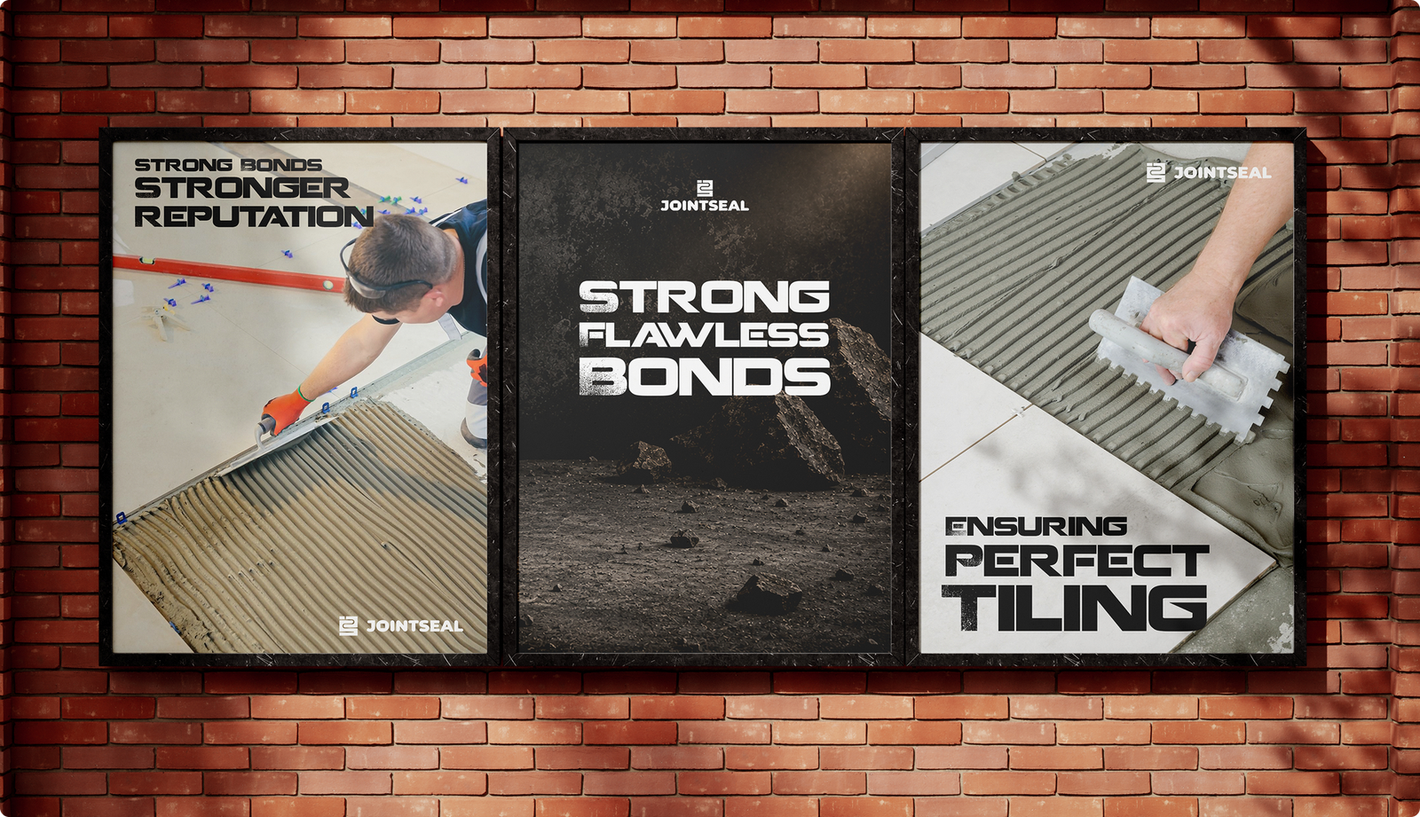
Jointseal marketing collateral
Jointseal brand campaigns

Consistent visual identity across all touchpoints ensures Jointseal not only stands out in a crowded market but also builds long-term credibility and preference.

Jointseal retail presence
Jointseal brand applications

Results

+70%
Boost in retail shelf visibility and recognition post-packaging redesign.
+40%
Increase in distributor orders within three months of the rebrand.
3×
Improvement in brand recall from marketing campaigns and collateral.

Let's Build Something Exceptional

Pick a time that works best for you, and let's talk about how branding and marketing can help your business grow.